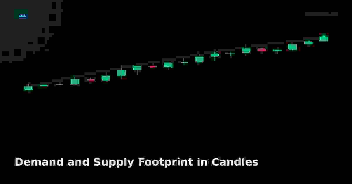
Demand and Supply Footprint in Candles
Every candle leaves a footprint of demand or supply that, read through VSA, reveals whether professionals are accumulating or distributing before price confirms it.
Demand and Supply Footprint in Candles
A candle is not just a shape; it is the residue of a battle between buyers and sellers.
Once you can read spread, volume, and close, the next step is recognizing that every bar leaves a footprint — a tell about whether demand or supply dominated the period. VSA uses these footprints to anticipate turns before the trendline breaks.
What a demand footprint looks like
A demand-dominant bar shows:
- Close in the upper half of the spread, ideally on the high.
- Volume rising relative to recent bars.
- Spread expanding, often pushing through the prior bar's high.
When a sequence of demand footprints appears at the bottom of a decline — especially after an oversold phase — it suggests professionals are stepping in. Price has not yet reversed, but the footprint says accumulation has begun.
What a supply footprint looks like
Supply dominance is the mirror image:
- Close in the lower half, often on the low.
- Volume rising into the down bar.
- Spread widening through the prior bar's low.
A cluster of supply footprints at the top of an uptrend, on increasing volume, warns of distribution — professionals unloading into retail buying.
Effort versus result, footprint style
The most informative footprints are the contradictory ones:
| Effort | Result | Footprint |
|---|---|---|
| High volume | Narrow spread | Absorption — pros taking the other side |
| High volume up | Close middle/low | Supply absorbed the demand |
| Low volume | Wide spread down | No demand; sellers unopposed |
The wick tells the tale
Long upper wicks on high volume after an advance mean buying met supply and was rejected. Long lower wicks on high volume after a decline mean selling met demand. These are footprints of transferred ownership — the essence of Wyckoff's effort versus result.
How to train the eye
Scan a chart and color-code bars: green for demand footprint, red for supply footprint, gray for neutral. After a week of this exercise, clusters of green at lows and red at highs will jump off the chart. These clusters are where professional money left its signature.
Why footprints lead price
Footprints form because professionals must accumulate or distribute over many bars — they cannot fill large positions in one trade without moving price against themselves. The footprint is the side effect of that process, and it shows up in volume and close behavior before the trend itself turns.
Next: the two most actionable footprints — no demand and no supply.
Live Chart
Open full chart →Related market data, powered by TradingView.
My Notes
Log in to save notes on this article and share them with the community.
Read next
Upthrust and Spring: Volume Confirmation Rules That Filter Fakes
Upthrusts and springs fail half the time on lower timeframes, but a three-part volume confirmation rule filters roughly two-thirds of false traps before you commit risk.
Read more →Smart Recommendations